loader

SD Worx Chocolate Box Packaging Design

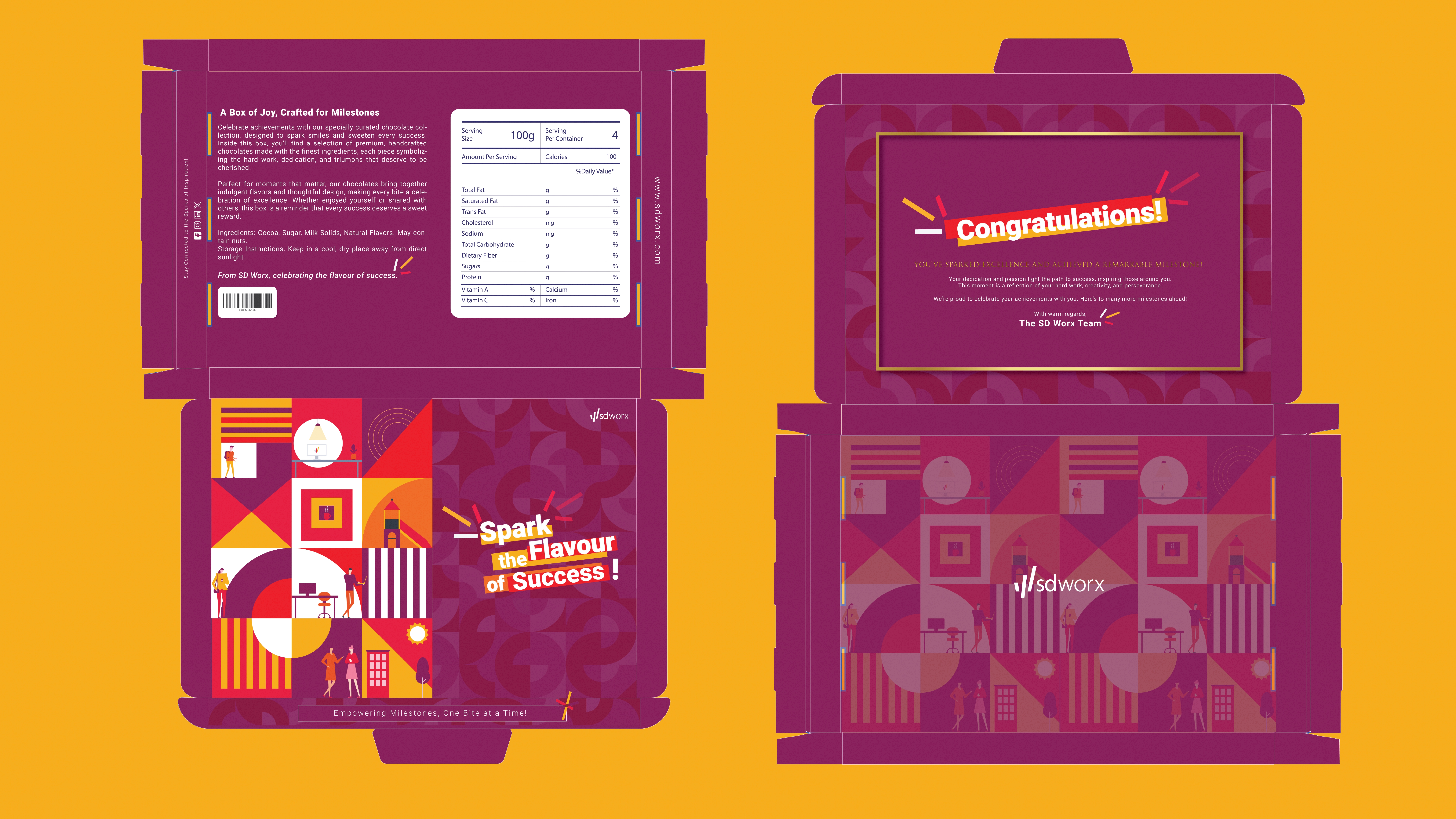
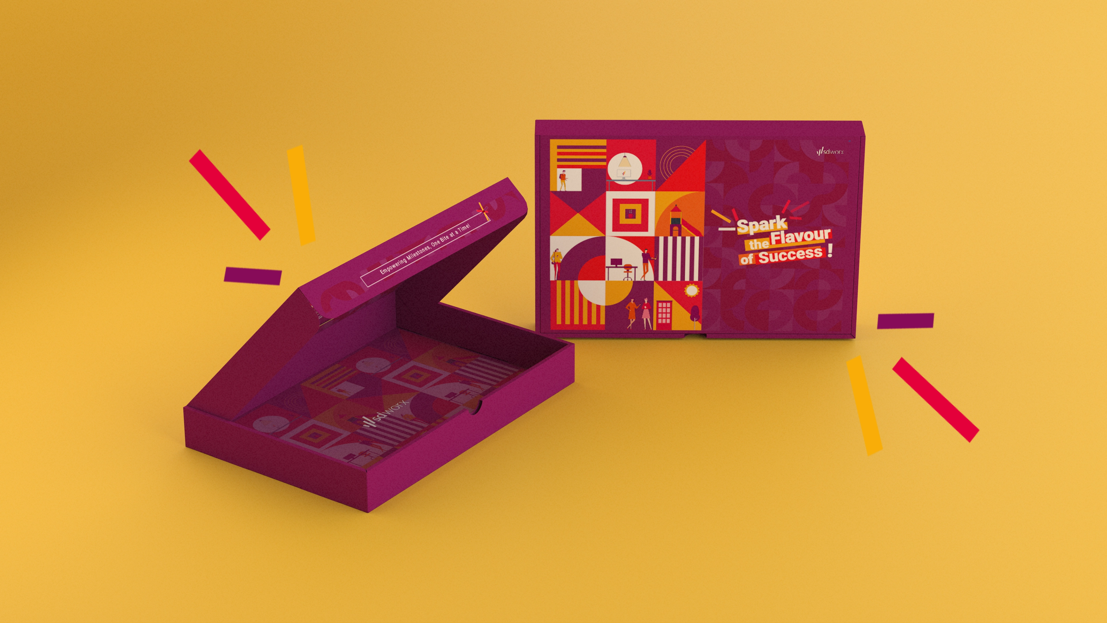
Turning a simple chocolate bar into a memorable moment that celebrates a milestone achievement—transforming temporary employees into permanent ones. This packaging was designed to combine professionalism, creativity, and joy, while staying true to SD Worx’s corporate identity.
  • YEAR Dec 2024
  • CATEGORY Packaging & Visual Design
  • Tool Used
work

Research & Ideation

  • Understanding the Audience:
    • Designed for employees transitioning into permanent roles. The goal was
      to create a design that evokes pride and celebrates success..
  • Brand Guidelines:
    • Incorporated SD Worx’s signature colors (purple, yellow, red) and logo for
      brand consistency.
  • Competitor Inspiration:
    • Studied celebratory packaging trends to create something fresh
      yet professional.

Concept Development

  • Outside the Box:
    • A bold mix of purple, yellow, and red for a standout look.
    • Abstract geometric patterns to symbolize growth and career progress.
    • Tagline: “Spark the Flavour of Success”—a playful nod to the occasion
      and the chocolate.
  • Inside the Box:
    • Prominent “Congratulations!” message framed with a golden
      border for a premium feel.
    • Celebratory graphics to add joy and excitement.
    • Handwritten fonts for a personal touch.

Functional Design

  • Horizontal Layout:
    • Created a perfect fit for the chocolate bar while ensuring
      the box is easy to open.
  • Space Optimization:
    • Reserved the back of the box for product specifications and nutritional
      details without compromising the design flow.
work

The Final Design

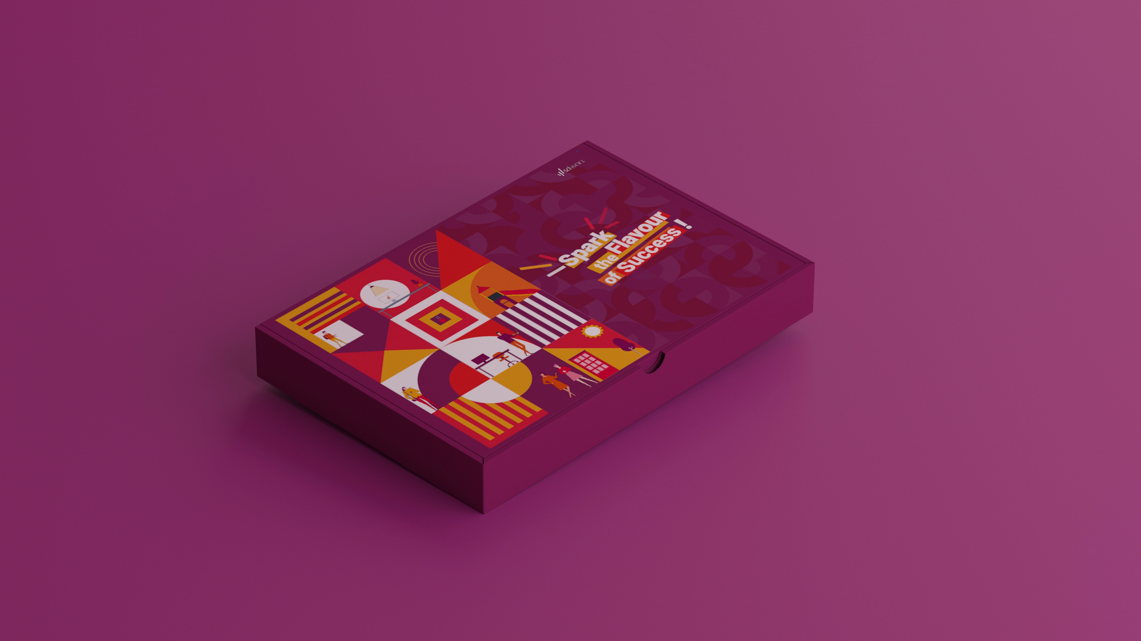
  • Vibrant Colors
    • Combines professionalism with celebration.
  • Geometric Patterns
    • Symbolizes employee growth and career milestones.
  • Tagline Placement
    • Clear and catchy, ideal for visual appeal.
  • Core Message(inside)
    • A bold “Congratulations!” front and center.
  • Graphics
    • Designed for photo moments—ideal for social media.
  • Premium Details
    • Golden accents add elegance.
work

The Experience

  • Why it Works
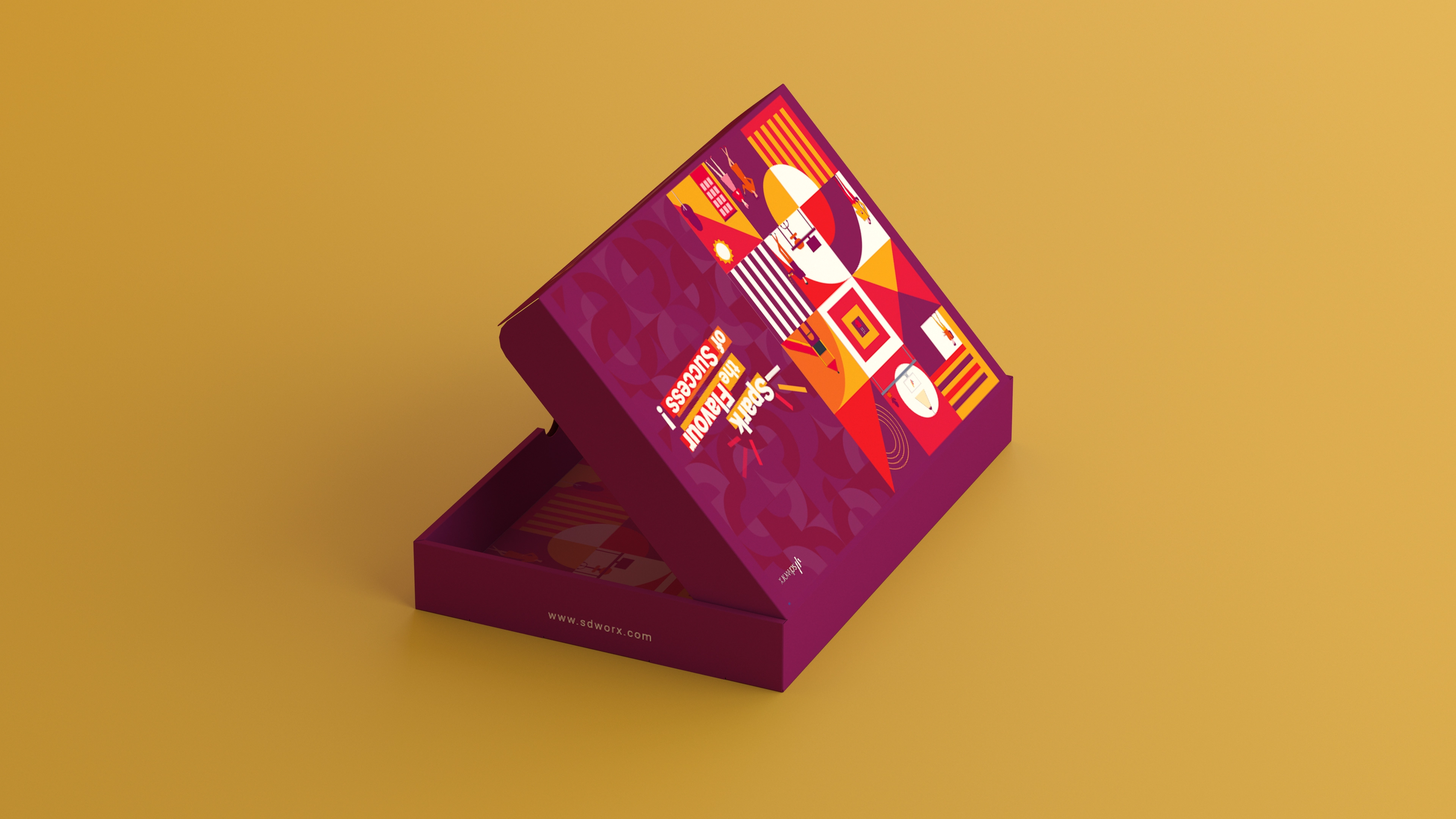
    • Memorable: Striking visuals make this more than just a box—it’s a keepsake.
  • Social Media-Ready
    • The vibrant design ensures it pops in photos shared online.
  • Celebratory and Professional
    • Perfectly balances joy with a corporate identity.

Challenges & Innovations

  • Balancing Tone:
    • Kept the design professional yet celebratory with patterns and colors.
  • Dual-Purpose Design
    • Seamlessly integrated branding outside with celebratory messaging inside.
work

Celebrate Your Success!

“Share your success with #LightYourSpark and inspire others!”

Use the hashtag to share your achievement and join the celebration!

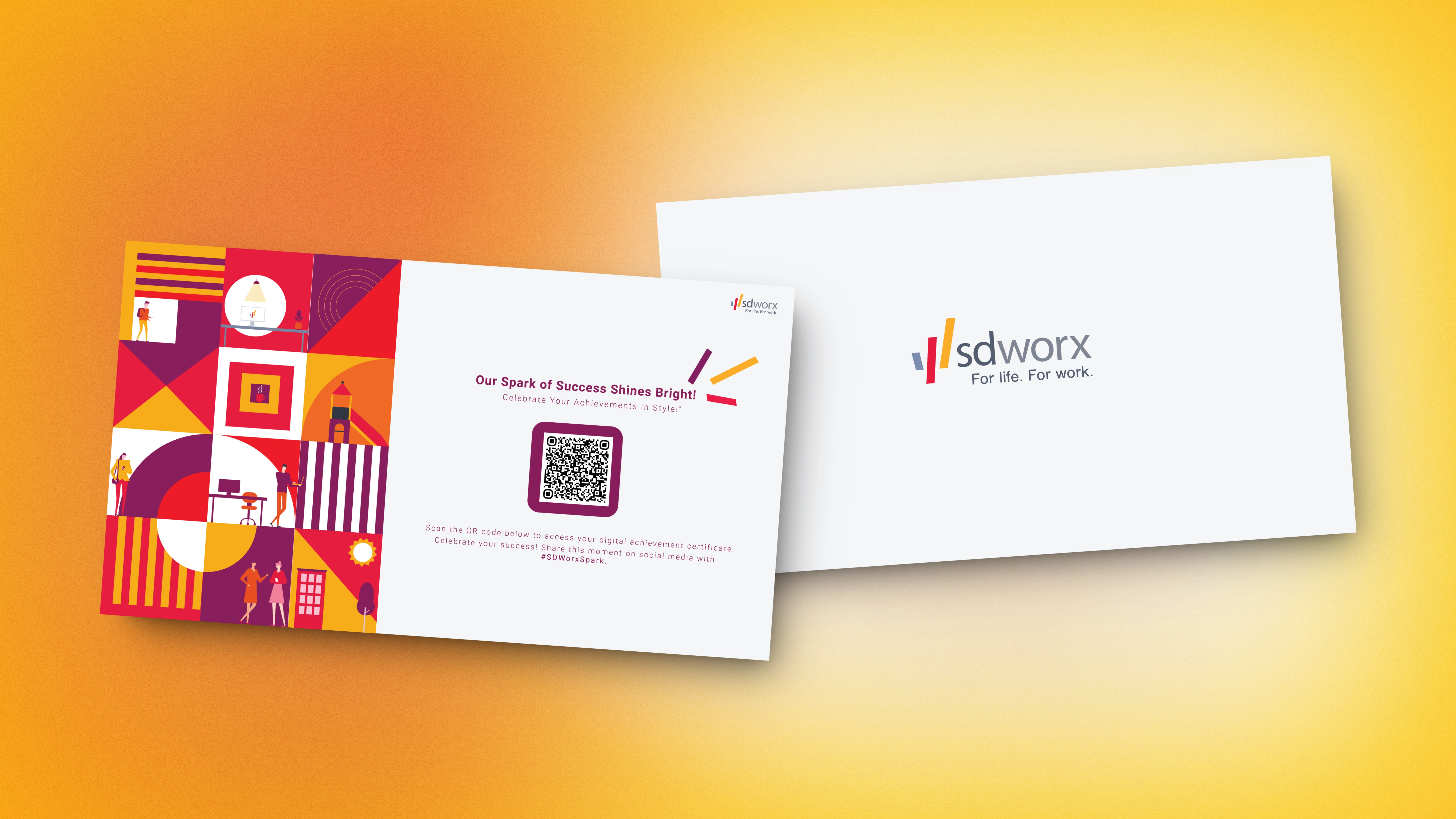
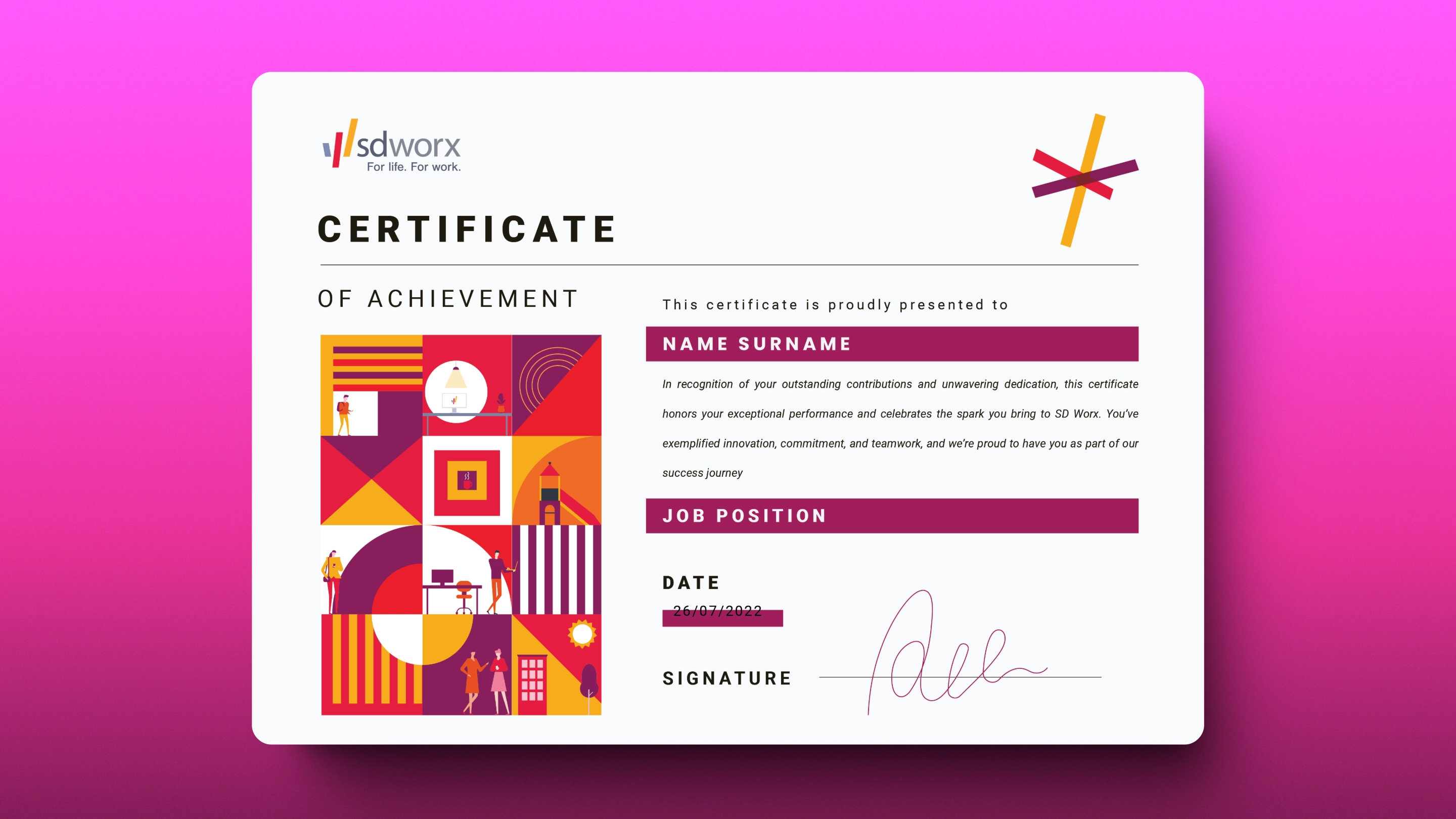
Your Digital Certificate

Note: The QR Code is thoughtfully placed inside the box.Scan the QR code below to access your personalized digital achievement certificate.

QR Code
work

More Pictures

  • Why it Works
    • Memorable: Striking visuals make this more than just a box—it’s a keepsake.
  • Social Media-Ready
    • The vibrant design ensures it pops in photos shared online.
  • Celebratory and Professional
    • Perfectly balances joy with a corporate identity.
work
work
work
work

3D Graphics & Unwrapping Process

Using 3DS Max, the Unwrap UVW Modifier was applied to the 3D chocolate box to create a 2D map of its surface. In the UV Editor, projection methods like Box Mapping or Cylindrical Mapping were used to align UV islands. Tools like Relax and Flatten Mapping optimized the layout, ensuring distortion-free textures. The UV map was exported to design textures in external software, then applied back to the model for a realistic and seamless finish. This method ensured precise placement of logos, patterns, and designs.

"Strategy" Department Email Banner

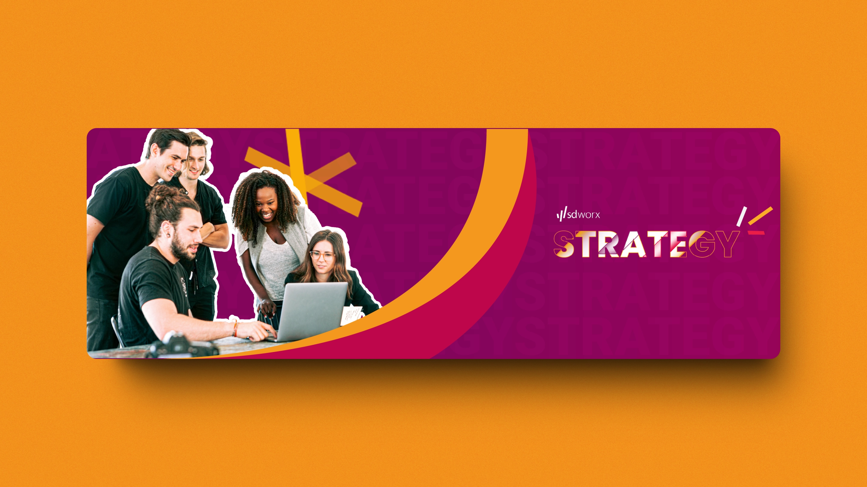
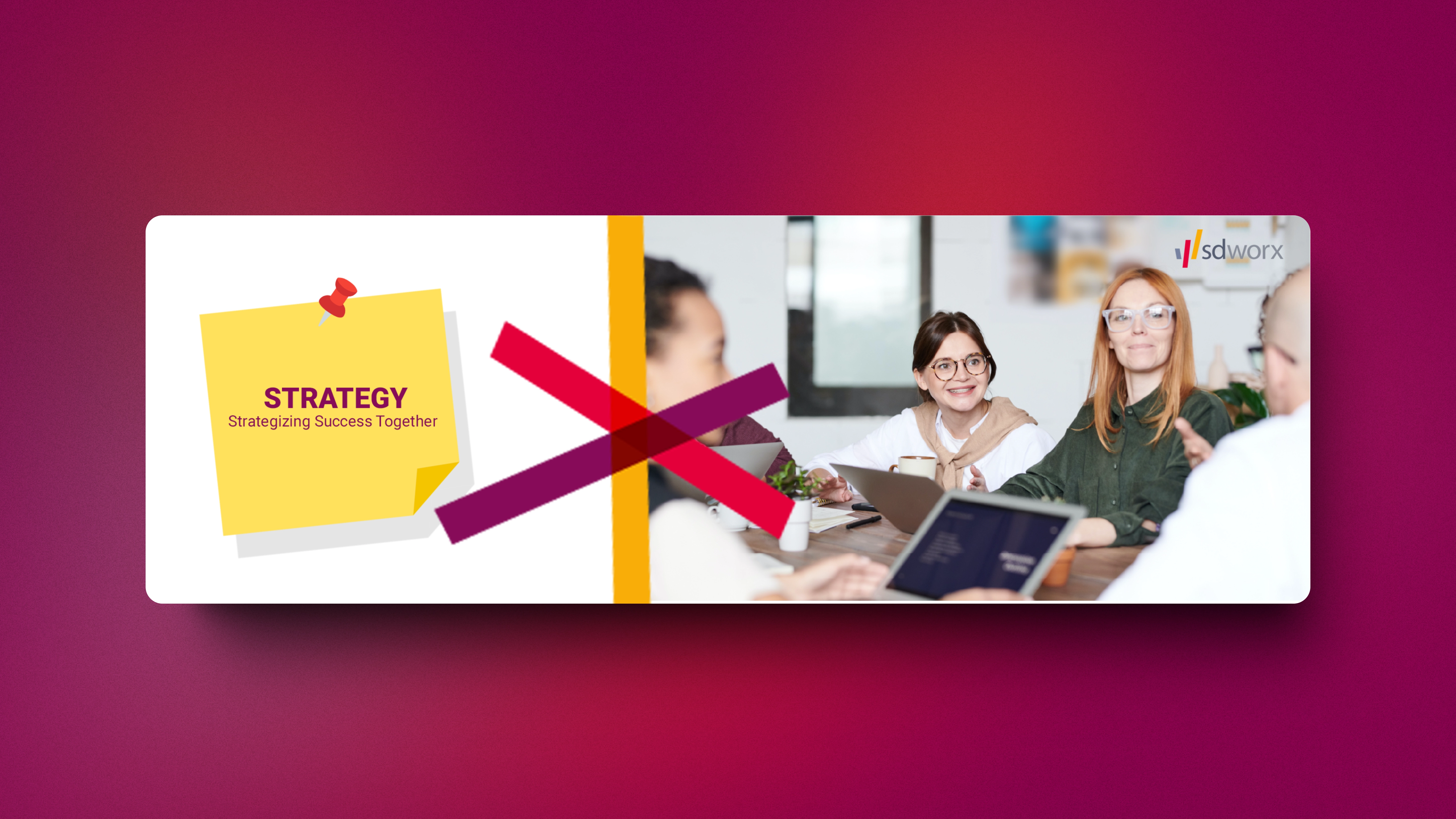
The email banner for the "Strategy" Department embodies the core principles of teamwork, collaboration, and professional alignment. Designed with a clean and cohesive style, this banner visually represents the department's focus on strategic planning and brainstorming.
  • YEAR Dec 2024
  • CATEGORY Visual Design
  • Tool Used

Key Highlights of the Design

  • Clear Focus
    • The word "Strategy" is the central highlight.
  • Collaborative Visuals:
    • Imagery of team discussions symbolizes teamwork and brainstorming.
  • Brand Consistency:
    • Aligned with the style of other departmental banners for uniformity.
  • Professional Design
    • Minimalist layout with balanced colors and clean fonts.

Banner Specifications

  • Dimensions
    • 600 x 200 pixels
  • Color Palette
    • Subtle shades of purple, yellow, and red to resonate with SD Worx’s
      branding while maintaining a professional appearance.
  • Typography
    • Modern sans-serif fonts to create a clean, corporate look. (Roboto)
work
work

Visual Preview

    • The word "Strategy" is the central highlight.
    • A background image depicting team collaboration or brainstorming.
    • Subtle design elements that harmonize with the organization's branding
      style.

How It Stands Out

    • Reinforce the importance of strategic thinking in every email interaction.
    • Represent the department’s role in fostering collaboration and growth.
    • Enhance the professionalism of internal and external communications.
  • MORE WORKS MORE WORKS
  • MORE WORKS MORE WORKS
  • MORE WORKS MORE WORKS
  • MORE WORKS MORE WORKS